Animation Settings
The Animation panel controls how your mega menu / dropdown menu appears and behaves when users interact with the header navigation.
It’s not just visual polish, it directly impacts UX, focus, and perceived performance.
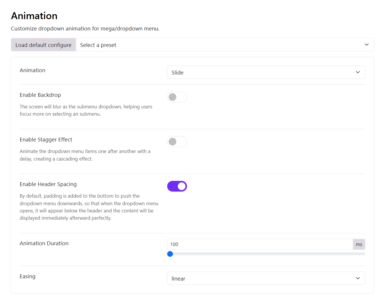
1. Animation Type
Choose an animation type to define how the dropdown appears. There are different animation options available for you to choose from:
- Slide
- Fade
- Zoom
- Slide & Scale
- Drop
- Flip
- Scale Y
- Blur in
- Or None
2. Enable Backdrop
If this option is enabled, the screen will blur as the submenu dropdown appears.
- Adds a blurred/dim overlay behind the dropdown
- Helps users focus on the menu
When to enable:
✔ Large mega menus ✔ Content-heavy navigation ✔ Modern UI designs
When NOT to use:
✖ Minimal/simple menus ✖ Performance-critical mobile sites
3. Enable Stagger Effect
If this option is enabled, it animates items one after another with delay. Menu items appear sequentially and creates a cascade animation.
Example:
Instead of appearing instantly…
Item 1
Item 2
Item 3
They appear like:
Item 1 → Item 2 → Item 3
When to use:
It's ideal to enable this option when you have:
✔ Mega menus ✔ Creative / modern websites ✔ Branding-focused UI
Avoid if:
✖ You want fast interaction ✖ You have many menu items (can feel slow)
4. Enable Header Spacing
What it does:
Adds padding below the header and pushes dropdown down slightly
Why it matters:
If it's disabled, dropdown may overlap header awkwardly
If it's enabled, dropdown appears cleanly below header (Recommended)
- Note: Only disable it if you want a tight / overlapping design
5. Animation Duration
Controls speed of animation and be measured in milliseconds (ms)
Recommended ranges:
- 100–150 ms → fast & responsive
- 200–300 ms → smooth & noticeable
- 300+ ms → slower, more dramatic
👉 Best practice: Keep it under 250 ms for usability
6. Easing
Defines how the animation accelerates/decelerates. You can choose one of options available in the drop-down list.