Navigation
The Navigation Widget in Astroid Framework allows you to create a customizable navigation menu with multiple menu items, icons, styles, and responsive layout options. This widget is suitable for creating vertical or horizontal menus in any section of your Astroid-powered Joomla website.
🛠 How to Use
📍 Step 1: Open the Layout Builder
- Go to your Joomla Administrator Panel
- Navigate to:
System→Site Template Styles→ Click on your Astroid template - Click the “Template Options” button
- Open the Layout tab
- Launch the Layout Builder
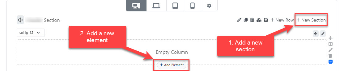
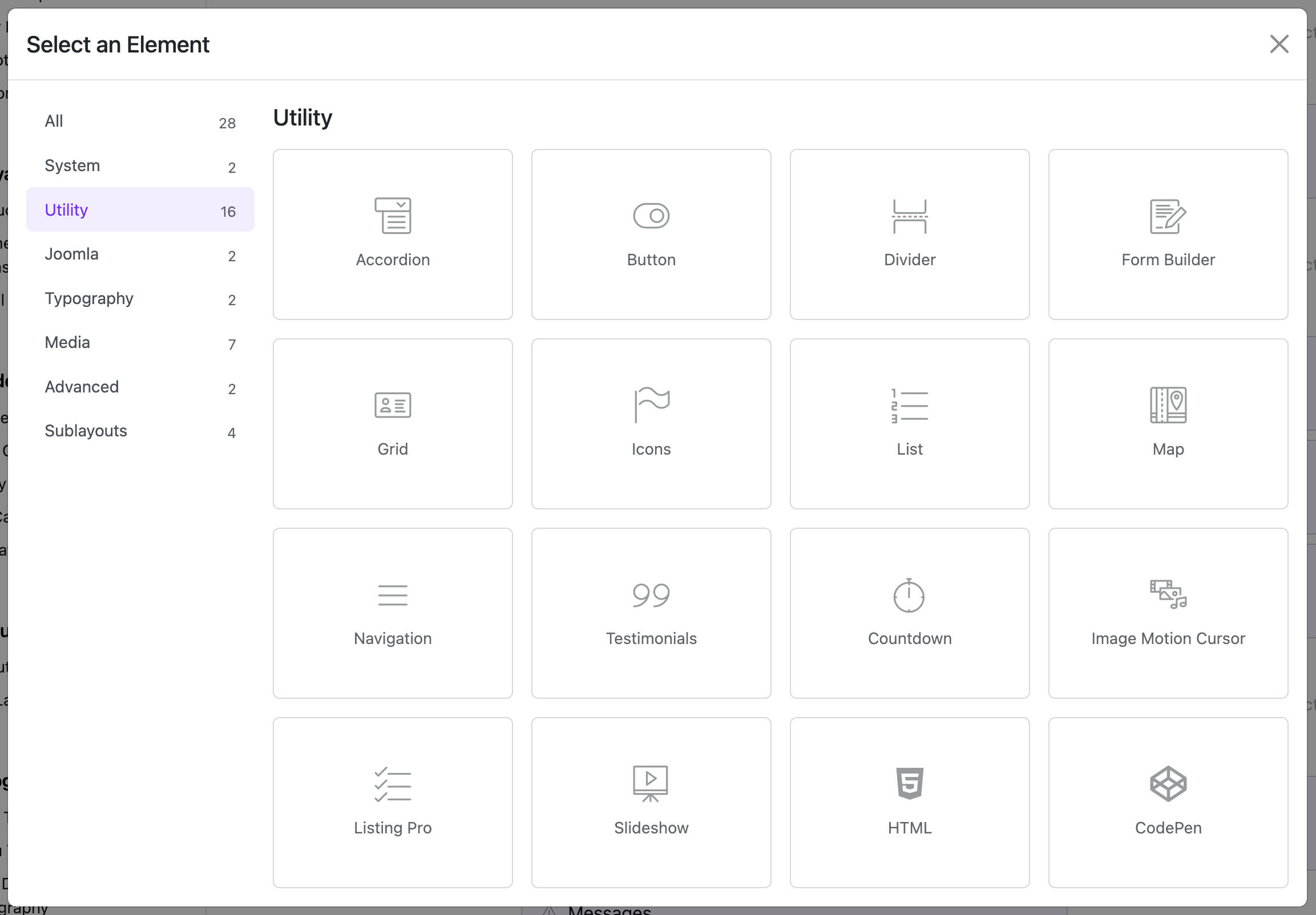
🧱 Step 2: Add the Widget
- Open the Astroid Layout Builder.
- Add a new Widget to your desired section.
- Select Navigation Widget from the widget list.
🔧 General Settings
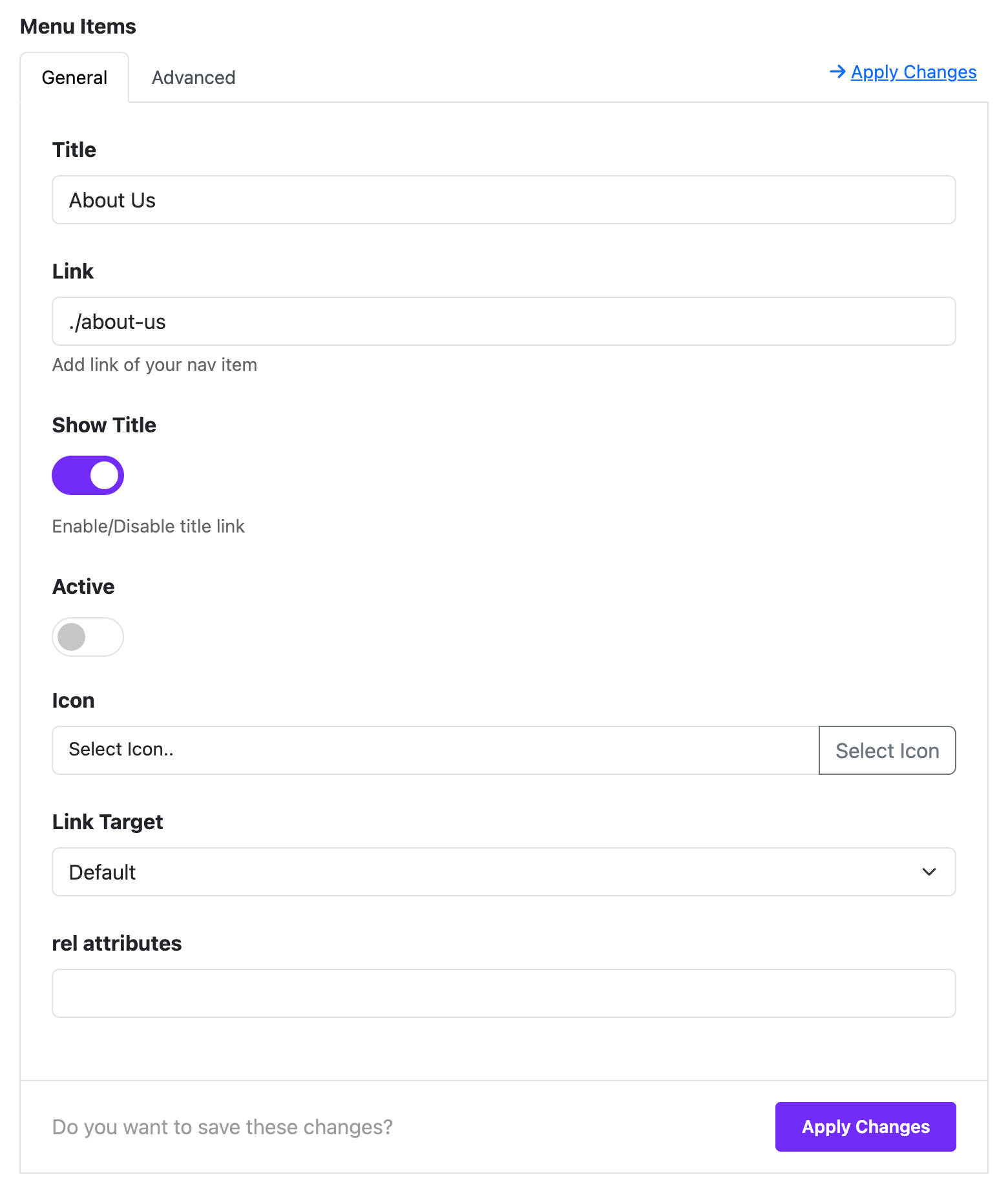
Menu Items
You can add multiple menu items by clicking the "Add Item" button. Each menu item includes the following fields:
- Title: The display text of the menu item.
- Link: The URL this item points to (e.g.,
https://example.com). - Show Title: Toggle the display of the title (Yes/No).
- Active: Mark this item as the active link.
- Icon: Choose an icon to display alongside the title.
- Link Target:
- Default
- New Window (
_blank) - Parent Frame (
_parent) - Full Body of the Window (
_top)
- Rel Attribute: (Optional) Set relationship attributes like
nofollow.
Dynamic Content Support
You can also integrate dynamic content sources by configuring:
- Dynamic Group Settings: Enable dynamic options.
- Dynamic Content Source: Choose the source of the content.
🎨 Style Options
List Style (under Misc Options)
- Navigation (default): Horizontal layout.
- List: Vertical (flex-column) layout.
Font Style
Customize font typography for the navigation items (e.g., font size, weight, line height).
🎨 Color Options
Set different color schemes depending on the state:
- Color: Default state
- Hover: When user hovers over the item
- Active: When the item is active
Each state allows customization of:
- Text Color
- Background Color
📐 Spacing Options
- Margin: Outer spacing for each item.
- Padding: Inner spacing for each item.
📱 Column Options (Responsive Layout)
You can control how the navigation widget appears on different screen sizes:
- Choose screen breakpoint:
xxl,xl,lg,md,sm,xs - For each size, set a column width:
1/2,1/3,1/4,1/5,1/6- Or inherit from global settings
⚙️ Assignment Settings
Decide where the widget should appear:
- On All Pages
- No Pages
- Selected Pages: If selected, you can choose specific menu items or pages where this widget will be shown.
🧩 Category
- This widget belongs to: Utility Widgets
💡 Tips
- Use icons for better visual clarity.
- Combine with column settings to create responsive layouts in Grid or Flex containers.
- Leverage Dynamic Content to pull in links from articles or menus automatically.