Slideshow
The Slideshow Widget in Astroid Framework allows you to create visually engaging image slideshows with overlays, titles, descriptions, and links. This guide will walk you through configuring the widget and utilizing its features effectively.
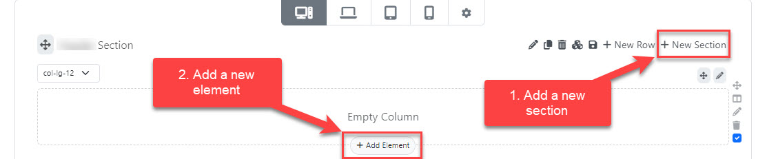
📌 How to Add Slideshow Widget
- Go to your Layout Builder in the Astroid Template.
- Click Add Widget.
- Choose Slideshow from the widget list.
⚙️ General Settings
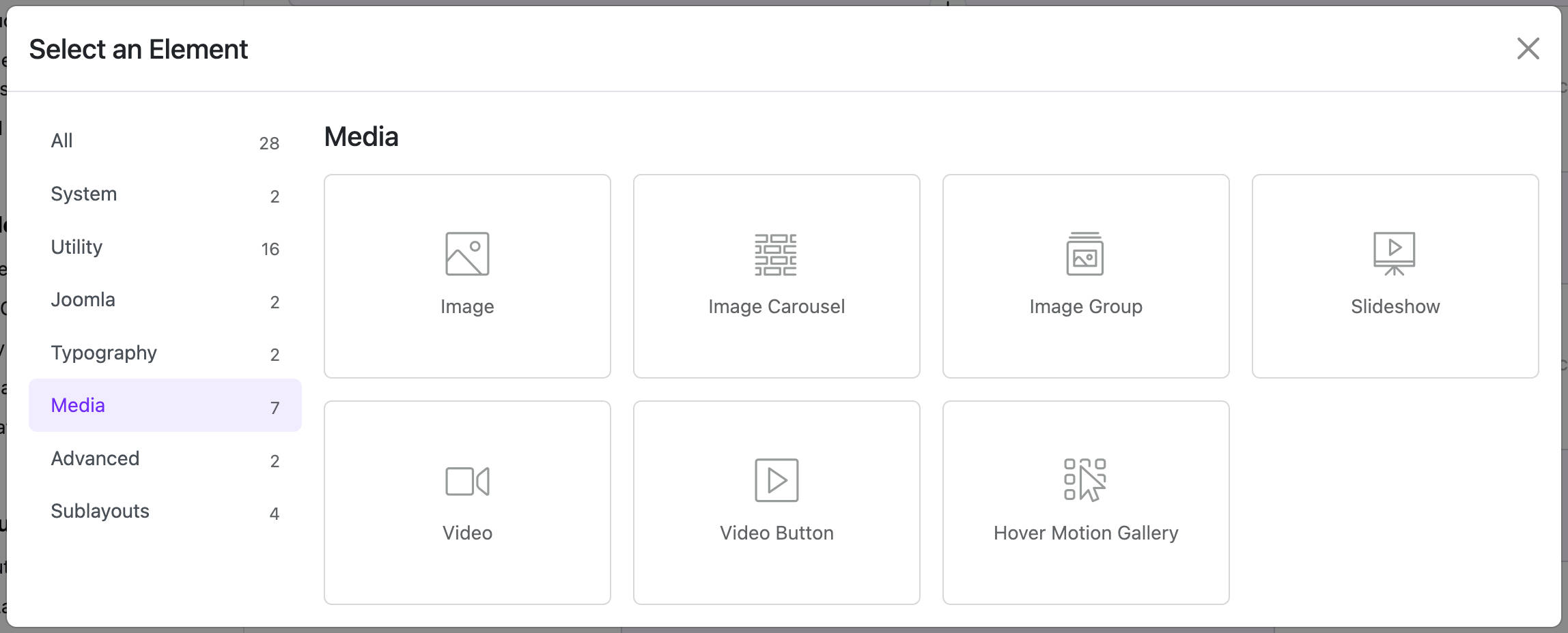
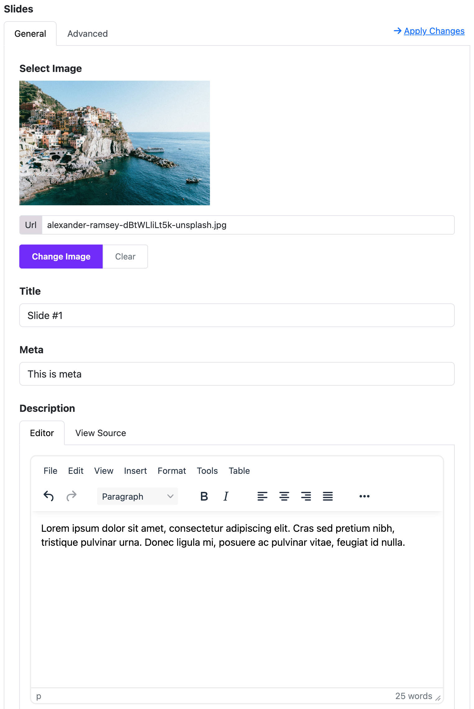
🖼️ Slides
You can add multiple slides, each with the following options:
- Image: Upload or select an image.
- Title: Add a heading for the slide.
- Meta: Optional metadata (e.g., date or category).
- Description: Add rich text content using a WYSIWYG editor.
- Link: URL to open when clicking the slide.
- Link Text: Button label, e.g., "Read More".
- Link Target: Choose where the link opens (
_blank,_parent, etc.).
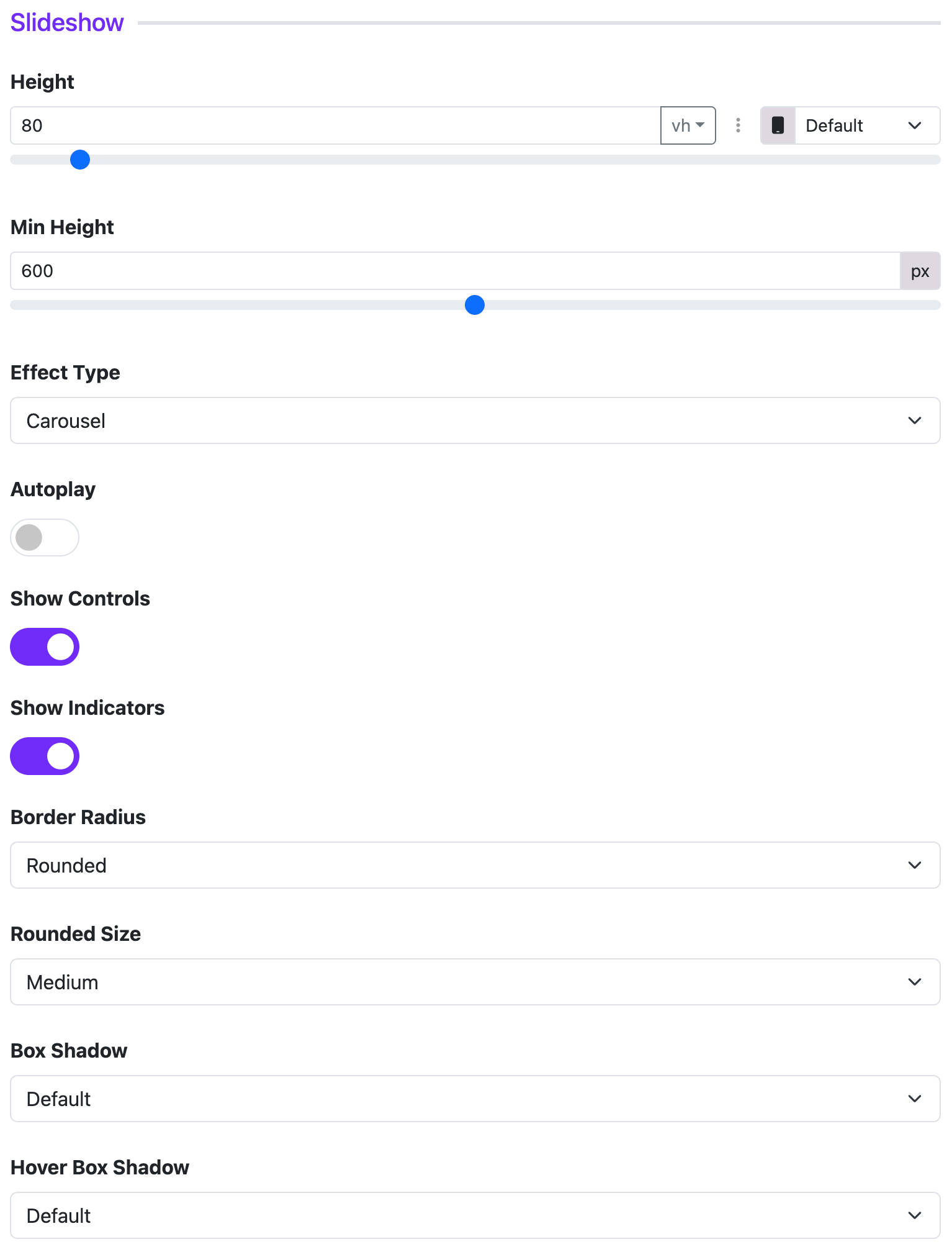
🎨 Slideshow Options
- Slider Height: Set the height in
vhorpx. - Minimum Height: Minimum height in pixels.
- Effect Type: Choose
carouselorfadetransition. - Autoplay: Enable automatic slide transitions.
- Interval: Time (in seconds) between auto slides (only when autoplay is enabled).
- Controls: Show next/prev navigation arrows.
- Indicators: Show navigation dots.
- Border Radius: Choose
Rounded,Square,Circle, orPill. - Rounded Size: Available when
Roundedis selected. - Box Shadow: Add a shadow effect.
- Hover Shadow: Apply shadow effect on hover.
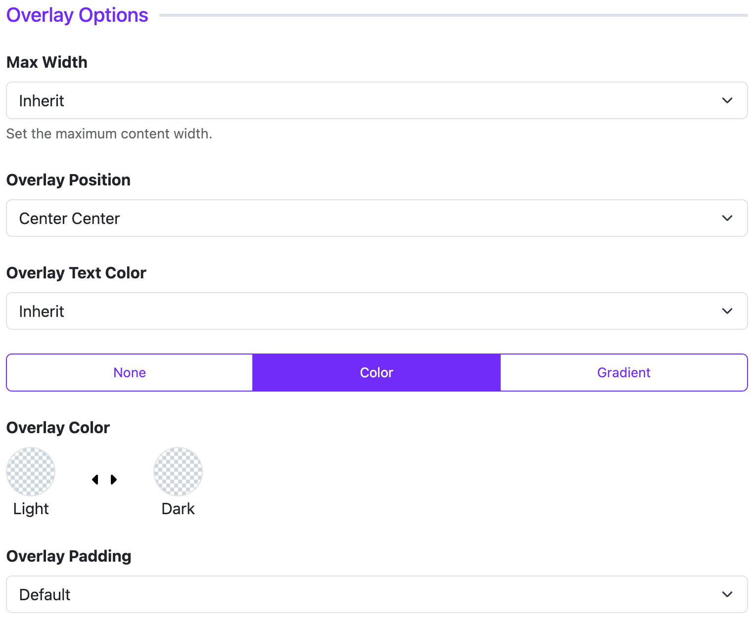
🎭 Overlay Options
- Max Width: Set a maximum width for content overlay (e.g., small, medium).
- Position: Control the position of overlay content (e.g., top-left, center).
- Text Color: Choose
LightorDarkfor text visibility. - Overlay Type: Use
Color,Gradient, orNone. - Overlay Color/Gradient: Set background color or gradient if enabled.
- Padding: Default, Small, Large, or Custom.
- Custom Padding: Use if “Custom” padding is selected.
🔤 Title, Meta, Content Styling
These sections allow you to customize the appearance of text:
Title Options:
- HTML Element: Choose heading level (
h1toh6, ordiv). - Font Style: Set font size, weight, etc.
- Margin: Set space around the title.
Meta Options:
- Font Style: Similar to title.
- Margin: Spacing for meta.
- Position: Display meta info before or after the title.
Content Options:
- Font Style: Customize body text style.
🔘 Read More Button (Link)
- Button Style: Select style (Primary, Success, Warning, etc.).
- Outline Style: Enable outline version of button.
- Size: Default, Large, or Small.
- Border Radius: Rounded, Square, or Circle.
📄 Page Assignment
You can control where the widget appears:
- All Pages
- No Pages
- Selected Pages: Choose specific menu items.
🔄 Dynamic Content (Advanced)
If you're using Dynamic Content, you can:
- Enable
Dynamic Content Settingsinside each slide. - Choose content source (articles, categories, etc.) dynamically.
✅ Tips
- Use high-resolution images for better visual impact.
- Ensure contrast between overlay text and image for readability.
- Use minimal text per slide to maintain focus.