Circle Text
The Circle Text Widget allows you to create rotating circular text combined with icons, background styling, spacing controls, and animation effects.
The Circle Text Widget is perfect for:
- “Read More” buttons
- Hero section decorations
- Scroll indicators
- Interactive CTA elements
- Portfolio showcases
- Agency and creative websites
- Modern sports or fitness templates
General Settings
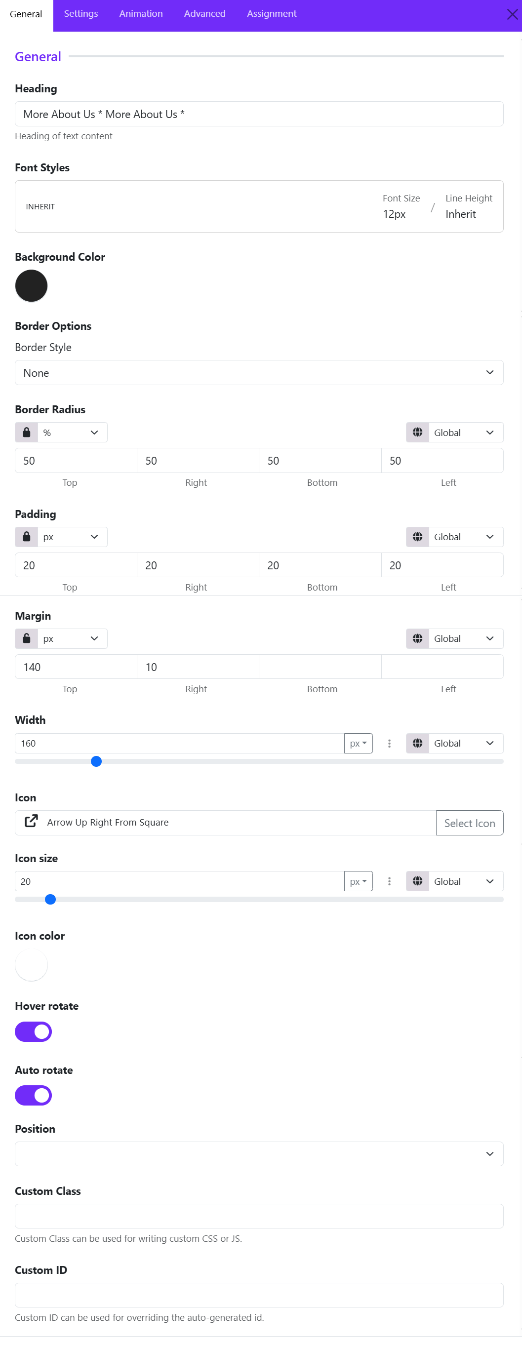
Heading
Enter the text that will appear in the circular layout. The text automatically wraps around the circle shape to create the rotating circular text effect.
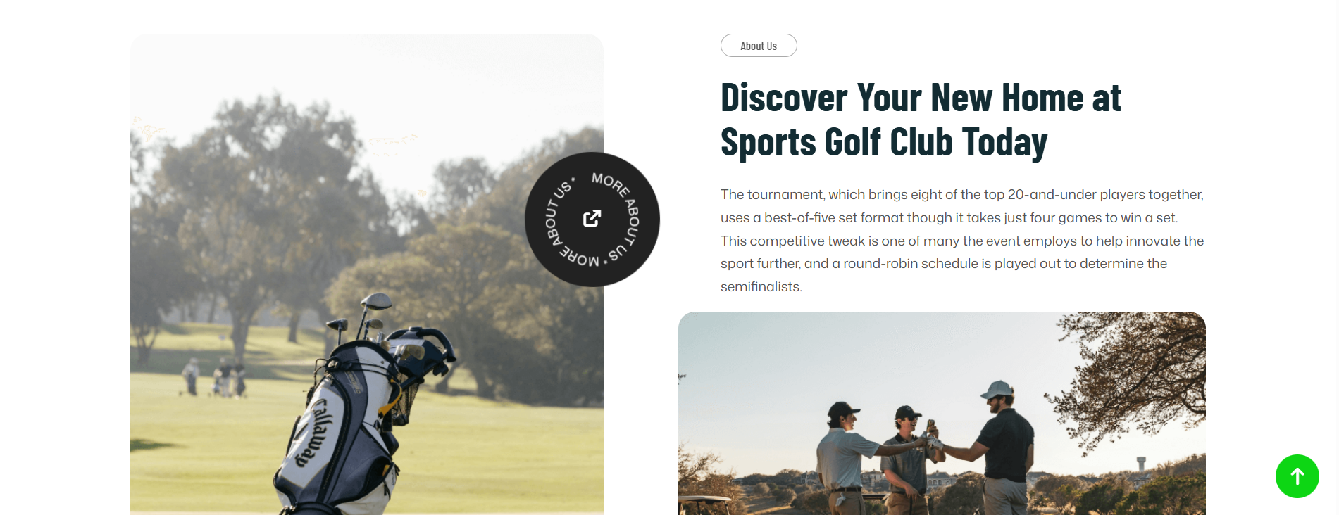
Example: More About Us * More About Us *
Font Styles
Customize the typography of the circular text.
Available controls include:
- Font family
- Font size
- Font weight
- Line height
- Text transform
- Letter spacing
Background Color
Choose the background color of the circular container.
Border Style
Select the border type around the circle.
Common options:
- None
- Solid
- Dashed
- Dotted
- Double
Border Radius
Controls the roundness of the widget container.
For example:
- Unit is set to: %
- All values are: 50
This creates a perfect circle.
Padding
Adds inner spacing between the text/icon and the widget border.
Example:
- Higher padding creates more breathing room
- Lower padding makes the content tighter
Margin
Controls spacing outside the widget.
Useful for:
- Separating the widget from nearby elements
- Adjusting vertical positioning
Example:
- Top margin: 140px
- Right margin: 10px
Width
Defines the overall size of the circular widget.
Example:
- Small width for compact buttons
- Large width for hero section decorations
Icon
Choose an icon displayed in the center of the circle. You can select an icon from the list.
Icon Size
Adjust the icon dimensions. Ex: 20px
Larger icons create stronger visual focus.
Icon Color
Choose the icon color independently from the text color.
Common combinations:
- White icon on dark background
- Brand-colored icon on light background
Hover Rotate
When enabled, the circular text rotates when users hover over the widget.
Useful for:
- Interactive UI effects
- Modern portfolio websites
- Creative landing pages
Auto Rotate
Automatically rotates the circular text continuously without hover interaction.
Ideal for:
- Hero sections
- Promotional banners
- Animated design elements
Position
Controls the alignment or placement of the widget inside its container.
Depending on the layout system, this includes: Relative and Absolute